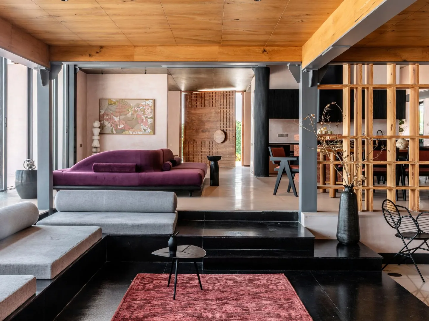
In the world of interior design, colour speaks volumes. While bold hues often steal the spotlight, it’s the subtle sophistication of nude colours—beige, taupe, sand, cream, blush, and warm greys—that has increasingly captivated architects and designers seeking timeless elegance. Nude palettes bring serenity, depth, and an organic softness to interiors, creating calming sanctuaries that feel refined yet inviting.
In this article, we explore five design-forward homes where nude colours take centre stage, transforming everyday spaces into design masterpieces.
1. The Parisian Flat: Understated Luxury Meets Art Deco Charm
Nestled in the heart of Paris, this 19th-century Haussmann apartment underwent a meticulous renovation by French interior designer Camille Hermand. The brief was simple: create a serene retreat using neutral tones without losing the home’s historic soul.
The colour palette is a masterclass in restraint. Soft taupes, warm beiges, and off-white tones dominate the walls and upholstery. The herringbone oak flooring, left in a natural matte finish, blends seamlessly with nude-toned linen sofas and sand-coloured marble countertops. Art deco detailing—curved archways, brass fixtures, and period mouldings—adds visual interest without disrupting the quiet palette.
The result is a home that whispers elegance. Natural light enhances the tonal layering of nude shades, proving that subtle doesn’t mean sterile. It’s a timeless aesthetic with emotional warmth.
2. Scandinavian Minimalism in Stockholm
Scandinavian design is celebrated for its clean lines and minimalist ethos, and this Stockholm apartment, designed by Note Design Studio, is a modern ode to the nude palette.
The open-plan layout uses tonal variations of nude—pale pinks, beige, and creamy whites—to delineate spaces without harsh contrast. A blush-toned kitchen island acts as a sculptural centrepiece, while light oak cabinetry and taupe walls provide continuity and calm. Even the textiles—from the shag rug to the suede dining chairs—adhere to the nude spectrum.
What makes this space stand out is the emphasis on texture over colour. Matte ceramics, boucle cushions, smooth plaster walls, and polished concrete floors create visual richness. Nude tones become the unifying thread, enhancing the sense of cohesion and spatial flow.
3. The Desert Retreat in Joshua Tree
In the arid beauty of California’s Joshua Tree National Park, this desert home by Studio AR&D Architects embodies the concept of blending with the environment—both visually and spiritually.
The architecture is low-slung and linear, with earth-toned stucco walls that mirror the desert landscape. Inside, a palette of sandy nudes, camel, and warm stone defines the interiors. Concrete floors in a light mocha finish contrast with raw timber beams, while soft nude linens and leather furnishings add comfort without overpowering the surroundings.
Floor-to-ceiling windows allow the outside colours—ochres, dusty pinks, and browns—to enter the home, making nude interiors feel like a continuation of the desert beyond. The seamless integration of landscape and design shows how nude palettes can enhance the meditative quality of a space.
4. Japanese-Inspired Tranquillity in Melbourne
Melbourne-based architecture firm Studio Goss designed this townhouse with a restrained colour palette inspired by Japanese wabi-sabi principles: beauty in imperfection and simplicity.
Walls are finished in pale clay render, while floors are covered in light terrazzo and blond timber. The cabinetry is custom-made from sand-toned oak, and the kitchen backsplash is a muted terracotta tile with hand-formed edges that provide subtle texture. Nude colours here are not just aesthetic choices—they evoke a sense of peace and groundedness.
What sets this home apart is its sense of ritual. The bathtub area, framed in cream-coloured stone, is surrounded by flax linen curtains that glow golden in afternoon light. Nude tones invite stillness and mindfulness—key components of a contemplative lifestyle.
5. Urban Zen in New York City
Amidst the noise of Manhattan, this Upper East Side apartment by designer Athena Calderone of Eyeswoon fame proves that nude interiors can thrive in an urban setting without feeling bland.
A monochrome base of warm grey and blush-tinted beige sets the tone, punctuated with sculptural elements: travertine coffee tables, textured plaster art, and oversized stone vases. A sand-hued boucle sofa anchors the living room, while layers of ivory linen and wool add tactile depth.
The kitchen is perhaps the showstopper—custom cabinetry in creamy mushroom lacquer paired with nude-veined marble counters, all offset by bronze accents. Calderone’s signature style—sensual minimalism—lets the nude palette become both canvas and character.
Why Nude Colours Work
Nude colours offer a unique alchemy of calmness, sophistication, and universality. Unlike stark whites or bold colours that demand attention, nudes create a restful backdrop that encourages layering and texture. They work in every light, every room, and every design style—whether it’s coastal, industrial, bohemian, or modernist.
Additionally, nude palettes have a grounding effect. They mimic nature’s own hues—sand, clay, stone, wood—reminding us of organic beauty. In design-forward homes, nude shades do more than decorate. They create atmospheres that nurture.
Final Thoughts
Design-forward homes that embrace nude colours aren’t simply neutral—they are nuanced. Through expert use of tone, texture, and materiality, these spaces evoke emotion, harmony, and a deep connection to place.
In a world saturated with visual noise, nude interiors are the quiet rebellion—spaces that soothe rather than shout, inspire rather than overwhelm. These five homes stand as proof that when thoughtfully applied, nude colours don’t fade into the background—they become the star.


